Linear regression machine learning with Excel
Linear regression is a simple machine learning algorithm that has many uses for analyzing data and predicting outcomes. Linear regression is especially useful when your data is neatly arranged in tabular format. Excel has several features that enable you to create regression models from tabular data in your spreadsheets.
1. What is a linear regression?
As the name implies, linear regression is an approach to modeling the relationship between a dependent variable $y$ and one or more independent variables denoted as $x$ in a linear form. Linear means that the dependent variable is directly proportional to the independent variables. Keeping other things constant if $x$ is increased/decreased then $y$ also changes linearly. Mathematically the relationship is expressed in the simplest form as: $$y=Ax+B$$
Here $A$ and $B$ are constant factors. The goal in supervised learning using linear regression is finding the value of constants $A$ and $B$ using the data sets. Then we can use it to predict the values of $y$ in the future for any values of $x$. Now, the cases where we have a single independent variable is called simple linear regression, while if there is more than one independent variable, then the process is called multiple linear regression.
Quick facts about Linear Regression
- Determining the strength of predictors
- Forecasting an effect
- Trend Forecasting
There are several types of linear regression analyses available to researchers.
- Simple linear regression
- Multiple linear regression
- Logistic regression
- Ordinal regression
- Multinominal regression
- Discriminant analysis
2. Application of Linear Regression
Linear regression was the first type of regression analysis to be studied rigorously, and to be used extensively in practical applications. This is because models which depend linearly on their unknown parameters are easier to fit than models which are non-linearly related to their parameters and because the statistical properties of the resulting estimators are easier to determine. Linear regression can be applied to many situations. Most of the applications fall into one of the following two broad categories:
- Prediction: In prediction or forecasting, linear regression can be first used to fit a predictive model to an observed data set of $y$ and $x$ values. After developing such a model, the fitted model can be used to make a prediction of the value of $y$ for an additional value of $x$.
For example: If we have a dataset of rainfall amounts and corresponding temperatures, then we can fit a linear model and use it to predict the amount of rainfall for a temperature value whose rainfall amount is not known beforehand. - Finding strength of relationship: Given a variable $y$ and a number of independent variables $x_1, …, x_p$ that may be related to $y$, linear regression analysis can be used to quantify the strength of the relationship between $y$ and the $x_j$, to assess which $x_j$ may have no relationship with $y$ at all, and to identify which subsets of the $x_j$ contain redundant information about $y$.
For example: If we have a dataset of rainfall amounts and corresponding humidity and temperatures, then we can use regression analysis to find out how strongly does the amount of rainfall depends upon each of these factors.
To estimate the parameters of the linear regression model various techniques can be used. The most common ones are Least Squares (LS) method and maximum-likelihood estimation methods. Let’s discuss here an example of simple linear regression using ordinary least squares method.
Least squares estimation:
How do we go about picking or finding the parameters of the model? One way is to make the predicted value of $y$ as close to the actual value of the training set. For example: Suppose we have a training data $(x_{data}, y_{data})$. Then the reasonable thing to do would be to make the predicted value $y$ as close to $y_data$ as possible. Therefore we try to minimize the sum of the square of the error i.e $$S = S_j (y_{{data}_j} – y_j)^2$$
For the simple case of a single independent variable after solving we obtain the following formulas for $A_0$ and $A_1$. $$A_{0}=\frac{n \sum_{i=1}^{n} y_{i} * x_{i}-\sum_{i=1}^{n} y_{i} * \sum_{i=1}^{n} x_{i}}{\sum_{i=1}^{n}\left(x_{i}-\text {mean}\right)^{2}}$$
$$A_{1}=y-A_{0} * \text {mean}
$$
3. Linear regression machine learning with Excel
https://www.youtube.com/watch?v=p4YgDMRV8aI&feature=youtu.be
Let’s look at an example: The data in the table below shows the temperature during the race and the corresponding average finish time in minutes of a marathon.

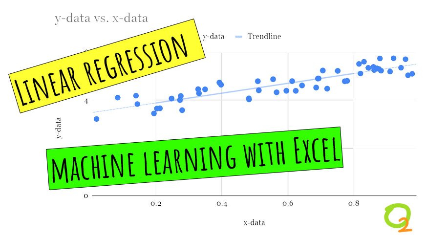
From the scatter plot we can see that the relationship between the $x$ & $y$ is somewhat linear. Using the formula we get the values of the parameters, $A_0 = 0.688 , A_1= 191.83$.
How do we make Prediction?
Prediction for a new test value of x is done simply by putting the value in the equation for the linear regression model. We now have the parameters of the simple linear regression model: $$y = 0.688x + 191.83$$
We can use it to predict the average completion time for different temperatures. For example, when the temperature is 71 F our model predicts the average completion time to be, $$y = 0.688*71 + 191.83 = 240.68 minutes.$$

Linear regression machine learning using data visualization feature in Excel
One of the most intuitive is the data chart tool, which is a powerful data visualization feature. For instance, the scatter plot chart displays the values of your data on a cartesian plane. But in addition to showing the distribution of your data, Excel’s chart tool can create a machine learning model that can predict the changes in the values of your data. The feature, called Trendline, creates a regression model from your data. You can set the trendline to one of several regression algorithms, including linear, polynomial, logarithmic, and exponential. You can also configure the chart to display the parameters of your machine learning model, which you can use to predict the outcome of new observations.
You can add several trendlines to the same chart. This makes it easy to quickly test and compare the performance of different machine learning models on your data.

Above: Excel’s Trendline feature can create regression models from your data.
In addition to exploring the chart tool, Learn Data Mining Through Excel takes you through several other procedures that can help develop more advanced regression models. These include formulas such as LINEST and LINREG, which calculate the parameters of your machine learning models based on your training data.
While this might not be the most efficient way to do production-level data science work, it is certainly a very good way to learn the workings of machine learning algorithms.
https://www.newtechdojo.com/learn-linear-regression-using-excel/
https://venturebeat.com/2020/12/30/you-dont-code-do-machine-learning-straight-from-microsoft-excel/


